Corona in Belgium
I lost a few hours this afternoon when digging into the Corona virus data mainly caused by reading this article at this website which gives a nice view on how to be aware of potential issues which can arise when collecting data and to be aware of hidden factors and it also shows Belgium.
- As a Belgian, I was interested to see how Corona might impact our lives in the next weeks and out of curiosity I was interested to see how we are doing compared to other countries regarding containment of the Corona virus outspread - especially since we still do not have a government in Belgium after elections 1 year ago.
- In what follows, I'll be showing some graphs using data available at https://github.com/CSSEGISandData/COVID-19 (it provides up-to-date statistics on Corona cases). If you want to reproduce this, pull the repository and just execute the following R code shown.
Data
Let's see first if the data is exactly what is shown at our National Television.
library(data.table)library(lattice)x <- list.files("csse_covid_19_data/csse_covid_19_daily_reports/", pattern = ".csv", full.names = TRUE)x <- data.frame(file = x, date = substr(basename(x), 1, 10), stringsAsFactors = FALSE)x <- split(x$file, x$date)x <- lapply(x, fread)x <- rbindlist(x, fill = TRUE, idcol = "date")x$date <- as.Date(x$date, format = "%m-%d-%Y")x <- setnames(x,old = c("date", "Country/Region", "Province/State", "Confirmed", "Deaths", "Recovered"),new = c("date", "region", "subregion", "confirmed", "death", "recovered"))x <- subset(x, subregion %in% "Hubei" |
region %in% c("Belgium", "France", "Netherlands", "Spain", "Singapore", "Germany", "Switzerland", "Italy"))x$area <- ifelse(x$subregion %in% "Hubei", x$subregion, x$region)x <- x[!duplicated(x, by = c("date", "area")), ]x <- x[, c("date", "area", "confirmed", "death", "recovered")]
subset(x, area %in% "Belgium" & confirmed > 1)
Yes, the data from https://github.com/CSSEGISandData/COVID-19 looks correct indeed. Same numbers as reported on the Belgian Television.
| date | area | confirmed | death | recovered |
|---|---|---|---|---|
| 2020-03-01 | Belgium | 2 | 0 | 1 |
| 2020-03-02 | Belgium | 8 | 0 | 1 |
| 2020-03-03 | Belgium | 13 | 0 | 1 |
| 2020-03-04 | Belgium | 23 | 0 | 1 |
| 2020-03-05 | Belgium | 50 | 0 | 1 |
| 2020-03-06 | Belgium | 109 | 0 | 1 |
| 2020-03-07 | Belgium | 169 | 0 | 1 |
| 2020-03-08 | Belgium | 200 | 0 | 1 |
| 2020-03-09 | Belgium | 239 | 0 | 1 |
| 2020-03-10 | Belgium | 267 | 0 | 1 |
| 2020-03-11 | Belgium | 314 | 3 | 1 |
Exponential number of cases of Corona
- Now is the outbreak really exponential? Let's make some graphs.
What is clear when looking at the plots is that indeed infections happen at a exponential scale except in Singapore where the government managed to completely isolate the Corona cases, while in Belgium and other European countries the government lacked the opportunity to isolate the Corona cases and we are now in a phase of trying to slow down to reduce and spread the impact.
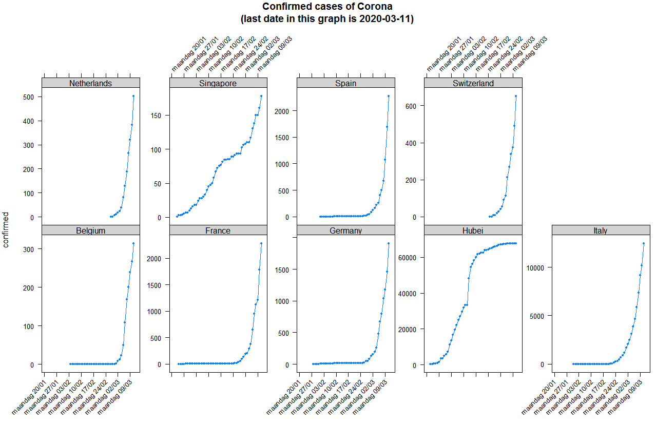
You can reproduce the plot as follows
trellis.par.set(strip.background = list(col = "lightgrey"))
xyplot(confirmed ~ date | area, data = x, type = "b", pch = 20,
       scales = list(y = list(relation = "free", rot = 0), x = list(rot = 45, format = "%A %d/%m")),
       layout = c(5, 2), main = sprintf("Confirmed cases of Corona\n(last date in this graph is %s)", max(x$date)))
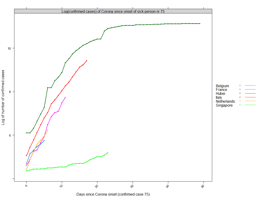
Compare to other countries - onset
It is clear that the onset of Corona is different in each country. Let's define the onset (day 0) as the day where 75 persons had Corona in the country. That will allow us to compare different countries. In Belgium we started to have more than 75 patients with Corona on Friday 2020-03-06. In the Netherlands that was one day earlier.
| date | area | confirmed |
|---|---|---|
| 2020-01-22 | Hubei | 444 |
| 2020-02-17 | Singapore | 77 |
| 2020-02-23 | Italy | 155 |
| 2020-02-29 | Germany | 79 |
| 2020-02-29 | France | 100 |
| 2020-03-01 | Spain | 84 |
| 2020-03-04 | Switzerland | 90 |
| 2020-03-05 | Netherlands | 82 |
| 2020-03-06 | Belgium | 109 |
Reproduce as follows:
x <- x[order(x$date, x$area, decreasing = TRUE), ]
x <- x[, days_since_case_onset := as.integer(date - min(date[confirmed > 75])), by = list(area)]
x <- x[, newly_confirmed := as.integer(confirmed - shift(confirmed, n = 1, type = "lead")), by = list(area)]
onset <- subset(x, days_since_case_onset == 0, select = c("date", "area", "confirmed"))
onset[order(onset$date), ]
Compare to other countries - what can we expect?
- Now are we doing better than other countries in the EU?
Following plot shows the log of the number of people diagnosed as having Corona since the onset date shown above. It looks like Belgium has learned a bit from the issues in Italy but it still hasn't learned the way to deal with the virus outbreak the same as e.g. Singapore has done (a country which learned from the SARS outbreak).
Based on the blue line, we can expect Belgium to have next week between roughly 1100 confirmed cases (log(1100)=7) or if we follow the trend of France that would be roughly 3000 (log(3000)=8) patients with Corona. We hope that it is only the first.
Reproduce as follows:
xyplot(log(confirmed) ~ days_since_case_onset | "Log(confirmed cases) of Corona since onset of sick person nr 75",
 groups = area,
 data = subset(x, days_since_case_onset >= 0 &
                  area %in% c("Hubei", "France", "Belgium", "Singapore", "Netherlands", "Italy")),
 xlab = "Days since Corona onset (confirmed case 75)", ylab = "Log of number of confirmed cases",
 auto.key = list(space = "right", lines = TRUE),
 type = "b", pch = 20, lwd = 2)
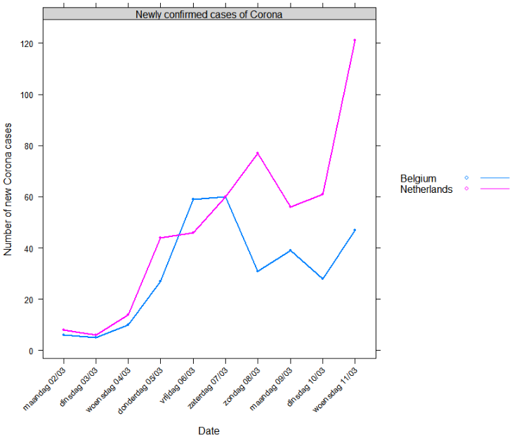
Compared to the Netherlands
- Now, are we doing better than The Netherlands?
Currently it looks like we are. But time will tell. Given the trend shown above, I can only hope everyone in Belgium follows the government guidelines as strict as possible.
Reproduce as follows:
xyplot(newly_confirmed ~ date | "Newly confirmed cases of Corona", groups = area,
 data = subset(x, area %in% c("Belgium", "Netherlands") & date > as.Date("2020-03-01")),
 xlab = "Date", ylab = "Number of new Corona cases",
 scales = list(x = list(rot = 45, format = "%A %d/%m", at = seq(as.Date("2020-03-01"), Sys.Date(), by = "day"))),
 auto.key = list(space = "right", lines = TRUE),
 type = "b", pch = 20, lwd = 2)